#because that's the context it was originally created in
Explore tagged Tumblr posts
Visit Tumblr Blog
Explore Tumblr blogs with no restrictions, modern design and the best experience.
Last Seen Tumblr Blogs


Fun Fact
The Tumblr office adopted Tommy, an 11-year-old Pomeranian.
Text
i just watched a tiktok analysis of The Locked Tomb's parallels to Lolita and holy shit. It's really mind blowing. i will never get over just how many layers upon layers of references and complexity there are in these books.
anyways the video really helped me realize why John has always majorly creeped me out. when i started getting in the tlt fandom here on tumblr after reading all three books i was a little surprised (but ig not that surprised because it kind of happens with all fandoms) by how many people love John and how...babygirl-ified he is. i found John very creepy and disingenuous in HTN, and i absolutely despised him by NTN. he's a sociopath and a truly horrible person hiding behind a mask of someone who is "eccentric" and "goofy dad energy" and "just trying to do whats best". I didn't feel like i was reading about John, i felt like i was reading about a silly and unthreatening persona named something silly and unthreatening like Jod. he's certainly an interesting character, and i love the way he's written, but i truly hate him as a person.
i also couldn't really put my finger on why all of his interactions with Harrow made me so uncomfortable, and this video really made me realize why. It's obvious that he is grooming Harrow throughout all of HTN (though, for what exactly? a stronger lyctor? a devoted follower? a person who views abuse and group sex as the norm?) and I realized that all of the contexts in which he refers to Harrow as his "daughter" are the wrong contexts to have a "daughter". He writes J+A in the sand, John plus the woman he was in love with, and proceeds it with J+H?? gross. so many of his interactions with harrow have this very surface level father-and-daughter-ness to them, which is purely because of the language John uses. when you stop listening to his words and only pay attention to his subtle actions and contexts he uses, John is a pathetic man with a power fantasy, and also a creep. he doesn't mean "daughter", he means "something I created. person I control." and as pointed out in the video, similar the Humbert Humbert's fantasy in Lolita about having a child with Dolores and turning that child into the next "Lolita".
also, Tazmiurs short story The Magicians Apprentice that she wrote before TLT? the relationship between the magician and the girl in the story is very similar to John and Harrow- which, if you go read the story or at least watch this tiktok and listen to the quotes from it- is disturbing to say the least. the parallels between eating, and the taking of ones childhood, and the eating of flesh and the eating of ones childhood is very horribly present. it almost makes me wonder if Nona's aversion to eating could be connected to this as well. (and even if some of this isn't intentional, i still think its interesting to be able to draw these parallels between all of these stories and try to make sense of the beautiful mess that is The Locked Tomb).
don't forget he also takes in Gideon, changes her name, and grooms her to be something that she isn't as well.
but the moment i truly started despising John was when he destroyed the earth, took its soul and made it into a woman, and made that woman his love. jesus christ.
i saw another tiktok about the potential that the wedding in ATN could be between John and Harrow...taking into account the Little Mermaid references (the original Little Mermaid, where the prince marries a nun instead of the mermaid) as well as all of the grooming John put Harrow through and the way he inserts Harrow as a stand-in for Alecto within his memories...yeah... literally my worst nightmare omg Gideon please kill your dad
i definitely recommend you watch these videos and look up other peoples opinions about these parallels because I'm kind of just repeating what they said and they'll certainly be more coherent than me lol
links to the videos:
https://www.tiktok.com/t/ZP8hd8wR7/
https://www.tiktok.com/t/ZP8hd8aRf/
#the locked tomb#tlt#analysis#rambling#harrow the ninth#alecto the ninth#and i think some of this is definitely intentional because tazmuir HAS read lolita and directly referenced it before#BEFORE YOU LEAVE A COMMENT PLS DO NOT TAKE MY RAMBLINGS TOO SERIOUSLY THESE ARE NOT POLISHED THOUGHTS YET
316 notes
·
View notes
Text
@outandloud If you'd been on my blog for even five seconds you would know that I have extensively criticized the antisemitism of the far left. It is despicable and inexcusable. However, none of that changes that fact that the two parties are not the same and that if Kamala Harris had been elected none of the horrible things Trump is doing would be happening.
Even you know that. You didn't refute any of the things listed in this post by me or by OP because you can't. You know that Kamala Harris wouldn't be doing any of those things. So you're not even trying to engage with the post. You're just throwing in some deceptive buzzwords about the "mainstream" and pointing to Leftist antisemitism as a shield.
Which is entirely disingenuous since: 1) Kamala Harris is not the Far Left. The Far Left hated her and shamefully contributed to her loss. 2) Kamala Harris condemned antisemitism, even when it cost her with bigoted far leftists, and is married to a Jewish man 3) your language about across-the-board untrustworthy "mainstream" media controlled by shadowy biased forces originates in an antisemitic conspiracy theory 4) Trump just gave a speech in which he called Jewish people a foul antisemitic slur in the context of railing against "bad people." So don't you dare tell me you care about antisemitism.
If Kamala Harris had won everyone would be better off. Anyone who didn't vote for her and didn't do everything they could to encourage others to vote for her too is complicit in what is happening now. MAGA is inflicting suffering on the world and on the American people, uplifting genocidal dictators like Putin, and attempting to create a Fascist dictatorship here in the U.S.
We're not going to let him succeed. Everyone is going to stand up and do their part to push back. The opposition is growing. The protests are growing. We will win in the end. But it will be difficult. And there will be suffering. And it will be too late for some people. And none of this needed to happen if only everyone had resisted the pull of obvious propaganda and showed up for Kamala Harris. That's a fact. And that's what this post was about.
And if you're one of the people who didn't vote for Harris and is now trying to hide from themselves behind lies then SHAME ON YOU. You have blood on your hands. You are stained forever. Stop making it worse. Stop spreading lies. Face yourself and your failures. And then square your shoulders and stand in solidarity with those of us trying to make it better. You owe it to the world.
For anyone still confused:
Kamala Harris would not be deporting US citizens.
Kamala Harris would not be taking away our healthcare.
Kamala Harris would not be shutting down hospitals.
Kamala Harris would not be giving tax breaks to billionaires.
Kamala Harris would not be sunsetting clean energy programs.
Kamala Harris would not be dragging us into a recession.
Kamala Harris would not be restricting FDA approval on vaccines.
Kamala Harris would not be bringing back asbestos to stimulate the Russian economy.
Hope this helps!
878 notes
·
View notes
Text
Directing Notes for ATEEZ [TOWARDS THE LIGHT: WILL TO POWER] Part 2 + 3
Seo Donghyun (ATEEZ Concert Director)
Part 1
[translated using google translate]
One of the ways to effectively convey a message in a show that lasts over two hours is to let the audience feel the message naturally through the story of the show. It is a deeper experience than conveying it directly through words. The show is composed of a total of five ACTs (acts).
Composing the cue sheet. Titles for acts, interludes, videos, etc. help those preparing the performance understand and communicate even if they are not shown to the audience. (Some titles were newly decided as I wrote the text.)
[ACT I. WE ARE THE LIGHT] tells the story of how we are all beings that originally had light. [ACT II. LOST] shows how we lose that light in the eyes and standards of others, [ACT III. TOWARDS THE LIGHT] shows the process of finding light, and [ACT IV. PRIME TIME] shows the moments when each person freely emits their own light, leading to the highlight of the performance. The last [ACT V. WILL] concludes the performance by sending cheers and support to the will to move toward the light.
As I mentioned before, concerts are relatively light on narrative. It's quite difficult to weave songs from different periods into one story in one performance. However, since ATEEZ has consistently released music that connects with their worldview since their debut, they are a group that is at an advantage in telling stories through their songs. It's a performance that's possible because they have a story that they've steadily built up. And we can't leave out the fact that they are artists with an extraordinary ability to express that narrative on stage. Thanks to that, they were able to maintain immersion even in theatrical scenes that show the story.
In order for the story to be well-communicated, the audience must be immersed in the performance without any breaks. The part that we paid the most attention to in terms of production in this performance was this ‘seamless immersion.’ This means making sure that there is a seamless connection between songs and between songs and videos (VCRs).
At its core is the Interlude Performance. Not only does it naturally connect songs, it also conveys parts of the story that are difficult to convey with existing songs alone through theatrical scenes. It also builds up the dynamics for the songs that follow, and provides rich context to the songs, making even songs you’ve seen many times feel new.
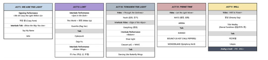
The interlude performance that unfolds immediately after 'WIN' and the section that leads into 'This World', 'Hypnosis Wake Up', and 'Guerrilla' are representative. The image of losing light due to the gaze and standards of others is not a narrative that can be expressed simply through a song, so we created new music and performances to convey it. We could have conveyed it directly through video, but we chose to minimize the video and convey it through performances on stage. Thanks to this, each member was able to prepare and present a new performance just for this concert during the interlude performance, and impressive scenes that highlight each member's charms were born. These scenes are also the result of the members' own efforts to constantly research and study for each performance.
The interlude performance that leads into 'IT's You' is also one of the representative scenes. The difficulties experienced in the process of finding light are depicted using the motif of a bird with its wings ripped off.
If the previously mentioned interlude performance is a way to continue the immersion with a narrative that connects with the song, the method that I will introduce from now on can be said to be a way to maintain the sense of feeling the flow of the performance. It is to prevent the acoustic gap from occurring. To put it simply, this can include starting the next song at an appropriate timing before the audience's cheers or the reverberation of the song fades away. However, a method that leads to a stronger immersion than this method is to connect the scenes with a sound that connects them.
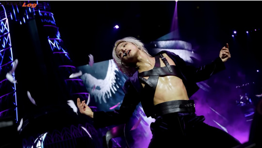
An example is the scene from the video 'Through the Darkness' in [ACT III] that leads to 'Youth'. In the last scene of the video, Yunho's face is close-up, and the ringing sound of the phone continues even after the video ends, naturally moving the gaze to the public phone booth on the stage. Then, it leads to the scene where Yunho appears and answers the phone. Although it is a simple sound effect, it connects the last scene of the video to the scene on the stage without any sense of incongruity. (In addition, matching the character in the last scene of the video with the first character on the stage is also a device that adds to the naturalness.) Here, the intro of the phone call between Yunho and Min-ki before the song starts highlights the relationship between the members and adds emotional immersion to the song.
In [ACT IV], a more daring approach was used when 'MATZ' begins. The 'MATZ' music already starts playing before the video ends. In the video, as Hongjoong and Seonghwa approach the camera and go out of frame and into the first verse, the gaze is moved from the video to the stage, making it seem as if the members come out of the video and make a surprise appearance on stage. The point at which the video ends and the point at which the song begins overlap to make it feel like there is no break.
I made the intro based on the phone conversation we had before the audition. The feeling that the words that I wanted to do a stage together someday became reality the moment I did this stage made the stage more special.
Of course, this kind of connection is not necessary in every scene of the performance. In some parts, a lingering silence may be more appropriate, and when there is a big change in content, it is necessary to give a break and refresh the mood. However, the reason why these connections are important is that they go beyond the function of filling the gap between songs and create a context and dynamic that makes familiar songs feel new.
Because the performance continues between scenes.
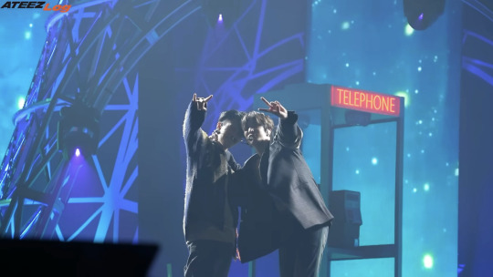
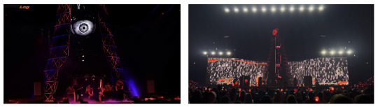
At the La Defense Arena in Paris, France, the tower has been extended to 20 meters. The tower has the greatest impact when it is the tallest structure within the venue.
When I captured this performance in a single photo, I wanted to create a symbolic scene that would reveal the identity of the performance. I needed a visual that would connect the somewhat abstract title, ‘TOWARDS THE LIGHT,’ with a specific visual language, and I thought that it had to be a set that functioned within the story rather than a simple sculpture. The result of that consideration was ‘Tower of Light.’
The reason why a 16-meter-tall structure was erected at the center of the stage is related to recent performance trends. After U2's The Joshua Tree Tour in 2017 left an overwhelming impression with 8K images implemented on large LEDs, many performances began to be directed centered around large LEDs. As a result, it was impossible to shake the impression that the stages were gradually becoming visually similar. Furthermore, when the VJ's image on the large LED was unrealistically larger than reality or the motion was excessive, the artist's presence was often weakened. This was especially important for a performance-oriented team like ATEEZ.
Even though it is huge, I thought that the tower, with its natural proportions to the people, would be a set that could blend in without harming the artist’s presence on stage. The VJ also thought that linking other sets with the tower would be more original and support the artist’s presence on stage rather than implementing the visuals on a single large LED panel. <Tower of Light> was a symbol that comprehensively considered these points.
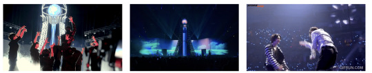
As each act passes, the tower changes into various forms and functions as a narrative structure itself. Among them, the most important scenes are ‘losing light’ and ‘the moment when light is regained.’
The tower that was shining brightly with a 'crazy form' in the opening changes into a 'watchtower' that symbolizes the gaze and standards of others. The watchtower was paired with the checkpoint set to create a more specific scene. Yunho who tried to avoid the gaze of the watchtower, San who failed to pass the checkpoint and ended up having to meet the standards of others, and Hongjoong who resisted this by playing the guitar on top of the checkpoint and shouting 'I got it back', the performance showed the appearance of losing light centered around the tower.
The highlight of the watchtower is the scene where the tower's eyes watch the audience. It has the effect of drawing the audience watching the performance into the performance.
The turning point where I rediscover the light within me begins with Wooyoung’s interlude performance. The scene where he reaches out to the sky expresses the moment of catching the light of the tower, and in the following ‘Silver Light’, I feel the ‘sense of light returning’. And it ends with all the members finding their own light and exiting into the tower of light.
Now that all the difficulties in the story have been resolved, it's time for a more comfortable and enjoyable atmosphere. 'Cresent pt. 2' begins with the gentle sound of the wind and waves, and while looking at the sea created by the blue laser and listening to the sound of the waves, it's strangely enough that you suddenly get the feeling that a real sea breeze is blowing from somewhere in the concert hall.
The tower that regained its light is now a lighthouse rather than a watchtower, and the 'WAVE' stage follows. Personally, I like <Dancing Like Butterfly Wings> that decorated the end of this section. Even though it was a song that was often included in the setlist, the members seemed to be having more genuine fun during this performance in particular (logbook: Dancing Like Butterfly Wings as seen from the stage). Perhaps because it was a stage performed after going through the process of losing and regaining their light, it was a happy time for not only the members but also the staff who watched them.
When I think of Dancing Like Butterfly Wings, I think this scene keeps coming to mind.
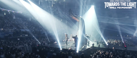
When captured on camera from the front, it appears as if hands of light are holding the sphere of the tower.
Yes. This guy's name is 'Hand of Light'. He was often called 'Homigot Guy', but he had his own name. Since the 'Tower of Light' was fixed on the stage from the beginning to the end of the performance, a device to visualize the message in a different way was needed at the last moment. That's how the 'Hand of Light' appeared in the center of the stage.
The giant hand reaching out toward the tower more intuitively shows the message, ‘TOWARDS THE LIGHT’, and it seems to respond to the scene in Wooyoung’s interlude performance right before ‘Silver Light’ where he reached out toward the tower. Although it is a movement with the same composition, in the main performance it was a scene of approaching the light, and in the encore it appeared as a scene of sharing that light. It is a symbolic message of support and solidarity to give strength to those who are still looking for the light, expanding on the story that unfolded throughout the performance. Although it is not without its regrettable parts, it was an important device to conclude the performance with the story of ‘us’.
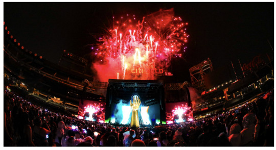
Concerts are unrealistic. Huge stage props are put into an empty concert hall, and when the show is over, they are all dismantled and the concert hall becomes empty again. It is a fantasy space and time that exists only in that moment. That is why I want it to be more memorable. As a message, as a story, as a symbol. I want it to remain in your heart and give you strength when you recall that moment. And that is not just for the audience. I want the same for the artists, myself, and everyone else who created this concert. I put more thought into the production than ever before, and with the efforts of many people including the artists, music producers, dancers, and staff, it became a reality on stage.
On the last day of the finale performance, right before ATEEZ first appeared in the opening of the performance, there was something I said through the in-ear. Up until now, I've always just shouted "standby, go" to the members through the in-ear at this timing, but now that it's really the end of the long journey, I really wanted to say something on this day. It was something I wanted to say to the staff and the members before the performance started. I wasn't able to say it to everyone who was with me, so I'm saying it through this post.
I'm grateful that I could join you on your journey to find light. At the end of the finale, I briefly felt the light I've been gathering inside me - Standby, go.
source part 3 source part 2
#ateez#park seonghwa#song mingi#jeong yunho#kim hongjoong#choi san#jung wooyoung#kang yeosang#choi jongho
24 notes
·
View notes
Text
I just woke up wtf Tumblr
Can't we have one moment of peace? Seriously?
I have been saving drafts about this situation for forever now
I'm starting to consider taking them out for all to read, I'm sure you all would love the amount of animosity I have against hypocritical or toonphobic people
I don't know what to really say to you all truly
I feel like no matter how much logic we throw at you, you'll ignore it and continue, cause realistically
It's pathetic.
You're really petty and pathetic for this.
You Want the Truth? Then Listen Up.
See that card? The original one?
I know some of you have looked at it before. Familiar, isn’t it? You talk like you know everything, like you understand what you're siding with, but most of you don’t have a clue, and honestly, I’m sick of hearing it.
Who’s the other creator?
ForsakenBanjo. He’s made that very clear- despite supposedly wanting distance.
You know why there are two creators?
Because this identity- the one he hates so very much- was shaped by both of us. Nothing was stolen, or taken, not like that's even possible.
He can scream “delusion” all he wants, but he can’t erase history. He can’t erase words. He can’t erase his play into this.
He wants to pretend now that it’s all just some phase, some fantasy., but if he’s so concerned for people’s mental health; If he’s so upset by it, then maybe he shouldn’t have been the one encouraging this in the first place.
To a 15 year old.
We built this together. This wasn’t just a passing phase or something I copied. This was my identity long before the internet ever knew my name. I just didn’t have the words for it yet. I was quiet about it. Isolated, but Forsaken was the one who said:
“Don’t hide yourself. Be real. Be true to what you are.”
And now what? Now it’s “delusional”?
Suddenly he’s the voice of reason?
“Oh, he didn’t know better.”
He was 17. Old enough to know what kind of influence he had. Old enough to be held accountable. You don’t get to build someone up and then act like you never coerced the blueprint.
And you wanna know something else?
When we were dating, I watched him block every single person who called him delusional. No debate. No discussion. Just block. Like clockwork.
Let that sink in.
Doesn’t look so noble now, does it?
Doesn’t read so well on paper.
So you tell me: Why are any of you still siding with a hypocrite?
You say you care about the truth, about what is considerably right or wrong, but the moment someone throws around a stigmatized word like “delusion,” you fold. You follow. No research, no context, just blind faith.
I expected better from some of you.
Toonixes are not delusional. This is lived. This is real. This is identity.
If you let one person strip that away with a label- especially someone who helped create it, then maybe you weren’t listening in the first place.
Do better.
Because I’m done being quiet about this.
#toonix community#toonixes#toonix identity#toonix label#toonix#dni toonixphobes#fuck toonixphobes#toonixphobic dni#take accountability
15 notes
·
View notes
Text
i think theres this idea in the general public that the "best" fanfic gets turned into real books like 50 shades of grey. but the truth is that the best fanfic can never be published as an actual book because its intricately woven into the canon material so its inseparable even if you change the names
#no shade (ha) to 50 shades. ive never actually read it so idk if its good#but imo the idea of creating an au fanfic thats so divorced from the original work is boring! why are you even making a fanfic atp#the only good fanfic is when you can tell the author loves the source material and uses it#the best fanfics ive ever read could never be published as actual books because it wouldnt work without the context of the original story
61K notes
·
View notes
Text
( TOME AU ) tfw you wake up in the abyss of the game youve loved after 4 fucking years and your first thought is "where the FUCK is my HAT" (hopefully i can make this into a comic ??? or something. idk)
#t.o.m.e tag 🌐#⚔️ — kirb (id)#kirbopher tome#terrain of magical expertise#my adhd vs my artistic willpower who do you think is gonna win guys place ur bets!!!!!!! <- INSANE#btw if ur wondering#i dont make comics because the amount of detail i put in EVERYTHING EVER is too much for a singular panel#i usually draw Very Big so drawing Very Small on a computer with a Mouse is hard . <- computer mouse artist#“YOU DRAW WITH A MOUSE” i hear half of tomeblr cry in fear#and to answer you#yeauh#btw for some extra context. this AU has sorta. toy story logic?? like. avatars of people in game ≠ the players inherently#they can speak THROUGH the avatars but for a majority including the main cast theyre different people from those playing the game#like. nyelocke ≠ whoever controls him . flamegirl ≠ steph alpha ≠ micheal etc etc#zetto and zeke r very different cases bc well. zetto is basically zeke's persona tbh. kirb was just created originally as an extension#but now he's his own person! how neat :>#this will Definitely Not have ANY consequences lmao#oh and in case u couldnt tell#froggypher IS canon to this one. ribbit ribbit im trapped in a hell of my own fucking making GOD FUCKING DAMN IT ALPHA WHERE THE FUCK AM I#you'll see where he is soon btw there's a Reason the bg is black and not White like forbidden power/kajet#hope this preview is anything though AGH
18 notes
·
View notes
Text
*complaining for no reason again because i am bored* i need more ppl to know that these. are all the same person these are literally canonically all the exact same individual person im begging u
literally almost all the ganondorfs are the exact same individual and almost all the ganons are the exact same individual, almost all the ganondorfs & ganons are the same exact person just in different forms and circumstances. except for FSA and maybe whatever the fuck is going on with TotK ganondorf but i still think it’s weird that he still has golden eyes & rounded ears when even the gerudo in TotK’s ancient past dont, but anyway ashfjsbfjsn
#not like you always have to subscribe to canon because it’s often impossible to know the truth of certain things#or some things that are canonical just suck and should be changed anyway but like#of all the things that are like relatively basic facts for ppl engaging in the Lore or whatever#ppl are like always. Always talking about ganondorf as if every iteration of him is a different person just like link & zelda#but so much of his character development stems from the fact that WW ganon and TP ganon are both different timeline offshoots of OoT ganon#i’m not even citing the ‘Official Timeline’ on this because it is silly & confusing but i just literally mean#in terms of basic canon continuity#that WW and TP were conceptualized even in the early 2000s to be the events that occur distantly after the two timeline splits OoT created#because OoT is a game about time travel and the entire concept of the split timelines in this series#originated from the two different scenarios that are created by link & zelda’s use of the master sword and the ocarina#WW ganondorf and TP ganondorf are both literal older versions of OoT ganondorf in 2 different futures#not to mention all of the ganons in the early games. OoT was made as a prequel that both literally and figuratively#attempted to humanize the main antagonist of the series#OoT ganondorf at the time WAS the ‘ganondorf with character development and an actual motivation’#WW ganondorf (who is the same person.) just actually got to vocalize what specifically his motivation was#which is great!! and also retroactively gives OoT ganondorf more context & depth#can u tell i am off my meds at the moment and have nothing better to do with my time ahsjfhskfhdj
308 notes
·
View notes
Text
da*2. is a game
#more thoughts below here be warned. i really enjoyed the introductory sequence and how it juxtaposed varric's dramatized version with the#real sequence of events. i also enjoy how they tied in lothering. imo id say the game has a really solid start. i also really enjoy the#visuals and stylistic direction of the game- i'd even go so far as to say i largely prefer it to inquisition (its just the oilyness LMFAO)#esp with the qunari and how they look.. less so with the proportions of the elves* (something that really irked me in inquisition is how#harold is forced to have the very clearly downscaled proportions while the elvish npcs (solas sera and basically every other elf#you interact with) dont have the slouched shoulders and very? crumpled looking frame). dont like that youre forced only to play as a human#though its very obvious that they were not given a reasonable amount of time to actually finish the game because OH MY GOD the reused#locations. the story was fairly solid at the start but the game is incredibly short (im in act 3 at the end of 2 days of playing) esp in#comp to origins. everything feels vaguely disconnected in a way thats uncharacteristic of bioware with the context of having played dao dai#and some of me1. and introducing the timeskips did Not help. i can see why people got absolutely attached to the companions however#with the system of friend + rival and it producing dichotomic benefits. rivalmances apparently existing also creates a really fun way of#interacting with your companions. i like anders#anyways completely unprompted thoughts on da2 over thank you for your time (i just needed somewhere to put them or i would go insane)
13 notes
·
View notes
Text
this is so funny to me actually bcuz this is 100% how i talk abt my characters ages. i know what YEAR they were born and i know what rheir ages are supposed to be at the start of the story but i dont actually know when it takes place?? im really bad at math. There was a moment where rainbow was supposed to be 23 and i somehow accidentally made her 17 lmfao
#theoretically it would take place in 2021 bcuz thats when i created my object ocs but the more time passes#the weirder it feels to have it take place years in the past#i considered moving up their birthdays by a few years but like. idk i like their birthdays theyre cute :3#bubblegum is SUPPOSED TO BE 15 and she was born july 2007#watermelon is supposed to be 7 and he was born june 2014#etc etc#starr is 27 and she was born september uhhh 1995 or 1997 i actually dont remember. whichever one makes sense#also that would mean building block was born in 2020 and since she's always gonna be a baby the furhter away we get#it means that she wouldnt have even been born when the story is actually supposed to take place. Like#i know their birthdays and their ages and what year they were born everybody else has to do the math#to figure out wtf is going on because I DONT KNOW#also that means that building block would be a pandemic baby lmao 😭#what was rhe vibe in nigeria in august 2020 during the pandemic. well i say that like it even happened in their universe#which there really isnt any reason for that to be true#it isnt historically important to mention like..... world war two or slavery or whatever. fucking obviously. in the context of objects#it gets messy so its better to just Not#also the months the characters were born really fuck me up bcuz jayden was born in late december#so for most of the first year that they met he would be.... younger than he actually is being born in 2003#but since building's block birthday and exact age is the most important timeline-wise#and she was born august 14th 2020 and she's seven months old when they first meet#then it canonically would take place in march 2021 which was my original intention#bcuz that is the actual date that i first created my object ocs#ANYWAY. boring character age ramblings#but its hard to keep track of so i dont even blame the author!!!! birthdays are weird and hard to keep up w/#when you dont know exactly when your story is supposed to take place#assuming its in a normal-ish world im sure fantasy ocs dont have this problem#txt#object ocs
9 notes
·
View notes
Text
giggling and kicking my feet when I realize x, y, and z from different stories I’ve experienced over my life influenced parts of a story I’m writing. Like yes, this concept from an author 40 years older than me clearly influenced how I write this character, or this world building element was loosely inspired from bits and pieces I’ve seen of a fandom I’m not in. It makes me happy that I can carry the legacy of those stories, thoughts, and moments and how wonderful it would be to encourage my (hypothetical) future audience to find these outside influences. That stories can be connected not because the worlds in them are necessarily connected, but that the people in this world can be connected and inspire each other
#I know many artists worry about being original enough and I’ve felt that too#But you gotta create regardless#How amazing that we can create stories and be inspired from each other#how your audience could discover for the first time the stories that inspired you from the stuff you make#and it becomes a web#and maybe your audience finds further meaning in your work because they have further context for what inspired you#i just think it's neat#Rambling I guess there are big feelings in me and I am just enchanted by the act of creation and art#I don’t have a tag for stuff like this :/#art stuff
3 notes
·
View notes
Text

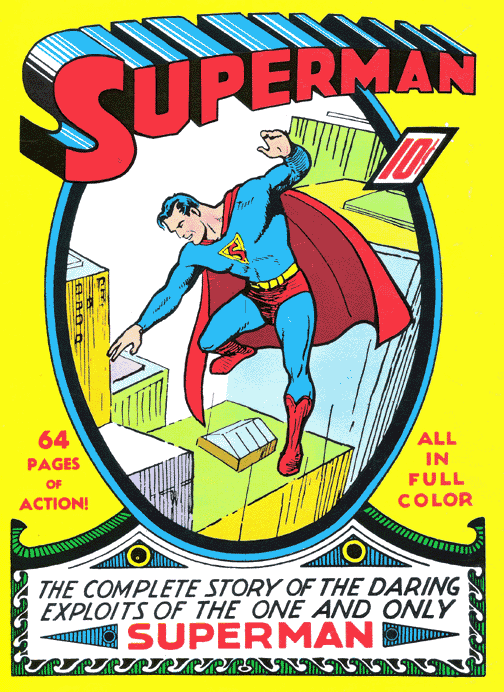
Delighted to learn the comic cover I originally chose to parody for my dream girl was actually a parody of a much older cover with a much meaner subtitle.
#I love her so much your honor#my art#superman#still not sure on what her secret identity’s name is#in the context of her world it can’t be too similar to Clark Kent#because that being the real name of the original Superman is public knowledge by the time she’s created#but it’s still similar because previous Supermen chose to keep it similar and she has to be like them
8 notes
·
View notes
Text

(They think the other is a idiot)
#asktotag#sonic exe#xhouse#((No idea how to explain we have like way too many interpretations and spoofs of the guy))#((Like I could ramble about the ''Master File & Distributions'' or ''Spoof'' variants but honestly talk so much I end up saying nonsense?))#((Main reason why my art seems to have no context is because I literally voice chat and ramble for 4-6 hours))#((Essentially about the newest hyperfixated multiverse we've created-))#((-for our far to energetic ideas for us to narrow down & ''choose'' one because there's no singular correct interpretation of art))#((There's far too many variables to consider one universe as the most canon so obviously we have to branch from every possible angle-))#((-and end up with at least 30 of the same character but in different flavours))#((NOT ACCOUNTING FOR THE FACT THAT IT'S ADDICTING TO MAKE SPOOFS FROM JUST ONE INTERACTION TO SEE WHERE THEY GO))#((Like. There's so much potential in the morality and development of a character based off of one or more events-))#((-that derail from their original situations! ENVIRONMENTS & SITUATIONS SHAPE SO MUCH FOR A PERSON & I HAVE TO SEE EVERY POSSIBLE ANGLE.))#((Sorry for the rant/ramble here-))#((-I never usually have the confidence to express how much I love making things.))#((I tend to bury my thoughts and say so little cause I usually think no one would be interested or would think I'm annoying for it))#((Sometimes you hear voices say the most stupid take & feel so enraged by its obsurdity that you temporarily lose your social anxiety))#((It'll probably return eventually because the moment I post this I can guarantee it will cause it's happened before. I am not immune.))#((Unrelated but I like having a variety of papers to draw on again. I can't share much yet due to conceptuals but Soon!!))
6 notes
·
View notes
Note
👀 i would be interested in hearing the deviantart points rant
Alrighty, the deviantART points rant. For context, I had a dA account from the time I was 12 and used it steadily until I was about 20. I was also a volunteer moderator with them for about a year, and they even offered me a job at one point. (But there was no way in heaven or hell they could've paid me enough to move to southern California, and god forbid they offer remote work.)
dA was one of the original social media behemoths. Never quite to the level of Twitter or Facebook, but if you were an artist you were on deviantART. It was a fantastic site back in its heyday. Artists got their start on there, recruiters were on there, art directors were on there, the community building features were fantastic. Yeah, it had its share of weird shit, but point me to a website that doesn't.
Multiple famous artists got their start on deviantART. Back then, it was a place you got real, legitimate work from. A place you could use to build a real, legitimate audience. The titans of early 2000s digital art that pretty much everyone knows (in the West, anyway), the ones who still have a massive effect on art styles today, basically all got their start on deviantART. It influenced the entire western culture of what art looks like on the internet, and that bled out into what art looks like everywhere else because these people made beloved shows and comics and movies and books and everything else.
But one of the best things about deviantART was that it was created at a time before everyone decided social media had to be slimmed down to its barest bones. It was a complex site, and there was a lot to it. That made it really easy for all levels of artists (and just plain art enjoyers) to use, and easy for them to make it function in a way that worked for them. This fostered a great environment where people of all skill levels could interact, share knowledge, and just absorb skills from one another.
Now, one area deviantART didn't initially cater to people was built-in payment options. They had a print shop you could upload your work to, but it was like Redbubble or Printful; merch selling, not custom work selling. So if artists wanted to offer commissions, they'd have to take payments elsewhere. (Usually Paypal.) Which was fine! That worked great!
But, well. Corporations gonna corporate. I forget the exact year, but one day they launched a new feature called Points. Points were a site specific currency, and they were one of the first (if not the first) to have such a thing. There were also some other things launched with it, including the ability to accept commissions with points as payment. You could also use points to buy site subscriptions, badges, stuff from the print shop, etc., or you could gift them to other people. You could also cash them out for real currency, for a fee (I wanna say the fee was 10%, and less if you were a subscribed user, but I can't remember exactly).
The conversion rate for Points was 1 Point=1US cent. Which seems fine on the surface! But the problem was psychological, because what they didn't do was actually make it look like that. Points instead looked like dollars, because there was no equivalent to actual CENTS in the Points ecosystem. So, for example, lets say you want to charge one dollar for something. That would look like this:
$1
P100.
Or ten dollars for something:
$10
P1000
Or a hundred dollars for something:
$100
P10000
See the problem? They're the same VALUE, but points just look massively bigger. This was especially a problem for people who didn't know what the conversion rate was because they just didn't know, or they were from other countries and REALLY didn't know because it wasn't related to their own currencies at all. (I think there was also a max amount of points you could charge for a commission, like a couple hundred dollars worth maybe? It was low when you converted it to real currency, if I'm remembering correctly.)
It devalued the art market like a knife to the gut. People were suddenly taking commissions for literal pennies just because the numbers LOOKED bigger. And because deviantART was such a hub for the art community, it bled out elsewhere. Prices started to dip other places too, because people who DID understand the conversion rate knew they could go on deviantART and get shit for super cheap from the people who didn't know or care. Which made other people lower their prices to compete, and it just resulted in a spiral to the bottom.
Would the art market have still tanked in the same way without the introduction of Points on dA? Maybe. But Points were the first domino to fall, and they were a massive one. The art market has never recovered even though deviantART has been 90% dead for going on a decade.
So yes. There's my internet history rant on Points and art values. Thank you for coming to my Ted Talk.
4K notes
·
View notes
Text
Artificial intelligence is worse than humans in every way at summarising documents and might actually create additional work for people, a government trial of the technology has found. Amazon conducted the test earlier this year for Australia’s corporate regulator the Securities and Investments Commission (ASIC) using submissions made to an inquiry. The outcome of the trial was revealed in an answer to a questions on notice at the Senate select committee on adopting artificial intelligence. The test involved testing generative AI models before selecting one to ingest five submissions from a parliamentary inquiry into audit and consultancy firms. The most promising model, Meta’s open source model Llama2-70B, was prompted to summarise the submissions with a focus on ASIC mentions, recommendations, references to more regulation, and to include the page references and context. Ten ASIC staff, of varying levels of seniority, were also given the same task with similar prompts. Then, a group of reviewers blindly assessed the summaries produced by both humans and AI for coherency, length, ASIC references, regulation references and for identifying recommendations. They were unaware that this exercise involved AI at all. These reviewers overwhelmingly found that the human summaries beat out their AI competitors on every criteria and on every submission, scoring an 81% on an internal rubric compared with the machine’s 47%. Human summaries ran up the score by significantly outperforming on identifying references to ASIC documents in the long document, a type of task that the report notes is a “notoriously hard task” for this type of AI. But humans still beat the technology across the board. Reviewers told the report’s authors that AI summaries often missed emphasis, nuance and context; included incorrect information or missed relevant information; and sometimes focused on auxiliary points or introduced irrelevant information. Three of the five reviewers said they guessed that they were reviewing AI content. The reviewers’ overall feedback was that they felt AI summaries may be counterproductive and create further work because of the need to fact-check and refer to original submissions which communicated the message better and more concisely.
3 September 2024
5K notes
·
View notes
Text

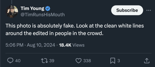

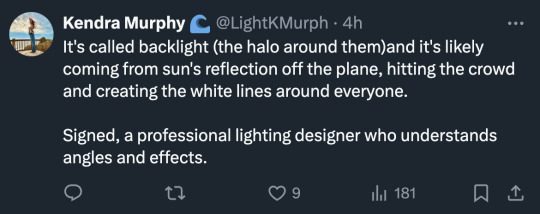
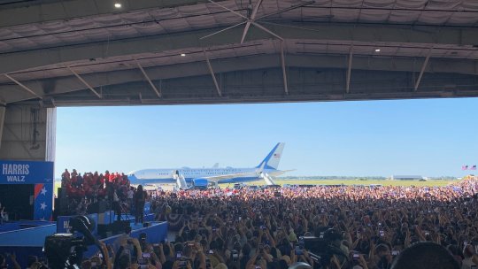
I think in this new age of A.I. the general public is going to need to increase their photography and lighting literacy. The response to this photo has just been a shit show.
There are people pointing out perfectly normal edge lighting and misunderstanding how reflections work.
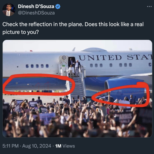
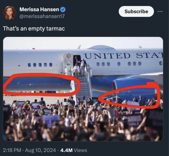
First the plane is parked at an angle. The tail is farther back than the nose. But also that is a curved surface and it tapers. It's reflecting the area to the right of the photo.
And the bottom of the plane is reflecting what is directly underneath. Which is the tarmac, not the crowd.
It should also be noted that photo was shot with a very telephoto lens and everything is super compressed. The crowd appears much closer to the airplane than they actually are.
But then someone who should have good understanding of lighting said this...
And now I'm worried for her clients. Because that's very... wrong.
Well, wrong-ish.
First, let's try to understand why this photo is setting off some alarm bells.
The crowd toward the rear is in shadow, but they are still very well exposed. But then there is also a bright light source creating a strong edge light on them. Looking at this photo with just the context of what is in it, there are some things that seem uncanny.
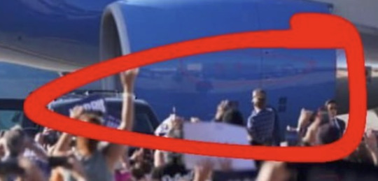
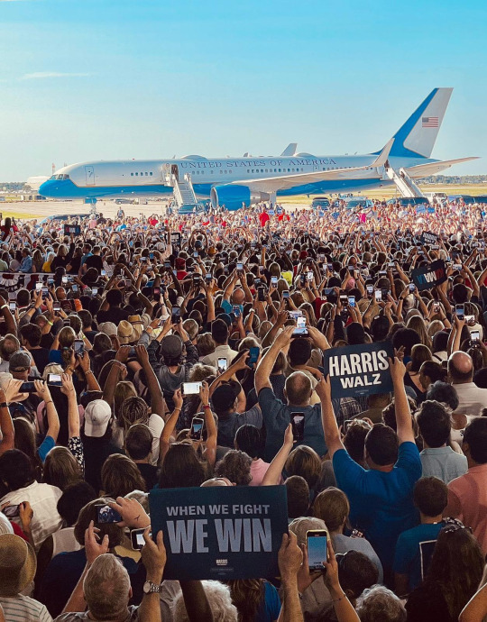
The information we do not have is the people in the shadow area are inside a very brightly lit airplane hangar.
So they have artificial light blasting them from the top.
But that light is still much dimmer than the sunlit areas outside so they appear in shade. But we are used to shade being much darker than areas in direct sun. So the balance seems off in our brain. We expect the people to be darker because we don't have the context of the bright hangar lights above them.
But the other issue is that the photo was post processed. It wasn't manipulated. The pixels weren't changed. But the exposure balance was altered.
If I were to guess, the original photo looked more like this...
But newer digital cameras can have 13 to 15 stops of dynamic range. And if you shoot in RAW, you can easily lift shadows and bring down highlights. You can balance the exposure so the dark parts aren't as dark and the bright parts aren't as bright. This photographer might have overdone it a bit in this case, but this is a fairly standard edit used to bring balance to photos.
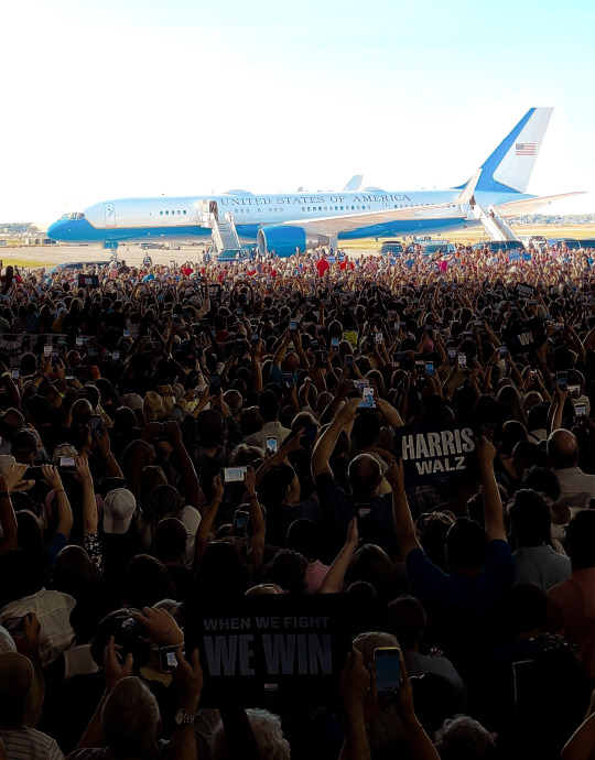
And lastly, where does the edge light come from?
Edge lighting or backlighting or rim lighting (all the same) should probably be called wrap-around lighting if you want to be more accurate.
It comes from a homogenous light source that is larger than the subject being lit. So with my knife photo, I placed it on a large LED panel light.
The light source was bigger than the subject so it wrapped around the edges.
And I'm afraid the airplane is not nearly large enough to create a light source to wrap around everyone in the crowd. It isn't even reflecting direct sunlight. So I'm sorry to say that lighting designer was mostly mistaken despite the confidence.
The light source is... everything.
That entire red area I highlighted is the light source.
As well as everything above and everything to the sides.
And the biggest aspect of that light source would be the sky above. I think people always forget the sky is a light source. If you are seeing blue, you are seeing light. And I guess the plane is included in that, but that entire highlighted red area is so bright, and so filled with sunlight bouncing around, that it creates basically a giant softbox. It becomes a huge single light source for the people in the hangar.
If you look at footage taken from way inside the hangar, you can see the camera adjusting exposure for the crowd inside, but look at what happens to the sunlit area outside.
What does that look like?
A giant softbox.
A single homogenous light source blasting light inside the hangar.
The sun is so incredibly bright that even when it is not directly lighting something, the light just bouncing around outside is enough to overpower the very bright hangar lights.
So, what have we learned from this?
Perhaps people should hire me to be their lighting designer.
Though I'm sure she is actually very talented. She seems to work with stage lights and this is more physics and photography.
Phystography.
4K notes
·
View notes
Text
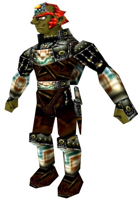
So About That Armor…
I regret to inform myself that I like it.
If you haven't seen it:
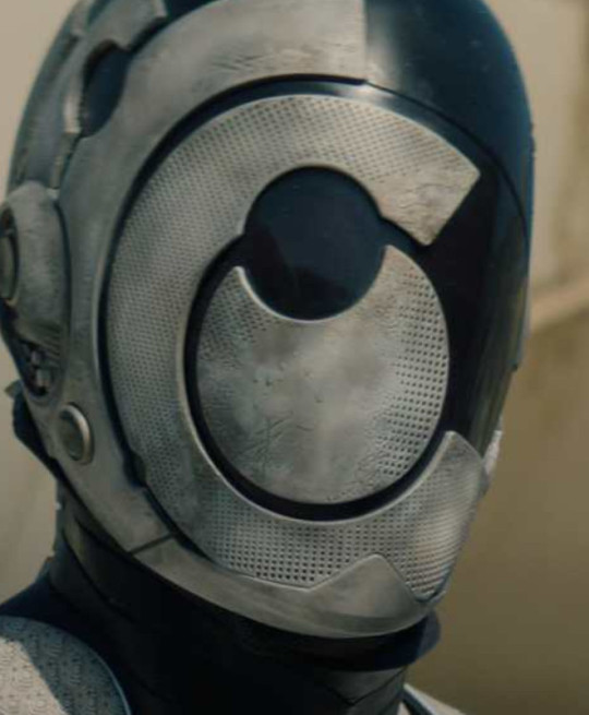
I'll give you time to take it in. This is a static, (hopefully) eternal text post, so take your time.
Ok so before I go further, you are allowed to have any and all opinions about the armor. Do not listen to me; I am a stranger on the internet who attaches himself to fictional murder cyborgs and treats them like kitty cats.
So first of all, it's weird. And I like it for that. Even if I found it to be the most infuriating piece of costume design ever, I still wouldn't be able to help but respect it for how strange it is.
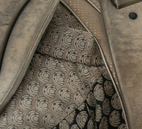
When it comes to fanworks, adaptations, new installments in a franchise, or even just different takes on the same trope, I love it when creators take things in an unconventional or even seemingly unrelated direction that upon closer inspection still relates to the base or original concept. To get what I mean, think goth interpretations of Rarity or Cosmopoliturtle's Pokémon redesigns. The TV series armor sits alongside these for me, because this was the thought process of the designer, Tommy Arnold:
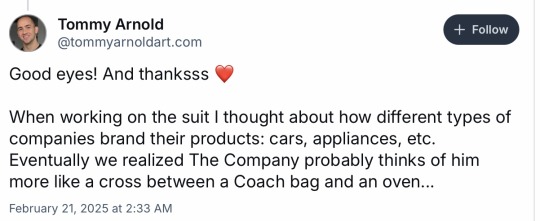
First of all, it is so funny that The Company would just brand their armor and by extension their secunits, their combat/security products, like Louis Vuitton bags. Also, the logo of The Company strikes a nice balance between being simple enough to be easily reproducible and recognizable, but complex enough to read as a logo and not just a simple shape or pattern. Plus, The Company logo being mostly just concentric Cs, clever there.
But there's also some worldbuilding and character expression in this design.
The Corporation Rim is just capitalism but more. A company slathering everything and everyone they create and own in mountains of logos, even when it's potentially impractical, showcases just how extensive corporatism is in this setting. Additionally, this design could be something of a status marker. Secunits are high end additions and/or alternatives to other security measures. Much like how logos on purses, tennis shoes, and cars serve to tell observers, "I have the fancy, expensive version of [insert category of thing here] ergo I am a very wealthy/powerful/cool person", a secunit covered in corporate logos communicates the high status and access of the client(s).
Now what was one of the first things we learned about Murderbot in the books? It disabled its governor module, the thing preventing it from defying orders and having any level of freedom, but instead of doing what it could to leave The Company, Murderbot just stayed with it and kept doing its intended function. For over four years. What else do we learn in the first book? That it feels most comfortable in the armor because this prevents humans from seeing its face, from treating it more like a person or human rather than a tool or bot. This makes the armor being composed of the logo of the group that both created and hurt Murderbot very symbolic.
Murderbot has internalized the message that it is a dangerous weapon and not a person deserving of care to the point that, at least at the beginning of the series, it shies away from anything that insists that it deserves the same kindness that humans do. It's only ever been taught what the company built it to do, so it doesn't know what to do next once it's obtained some semblance of freedom for itself by disabling its mental shock collar and so keeps doing what it's always done, even though it very much would rather not be in such a situation. Even by the most recent book, System Collapse, Murderbot is still wrestling with the idea that it matters beyond how it can assist others. Murderbot finding comfort hiding behind the very thing that will not let you forget the company that enslaves it, is just juicy theming.
Also, the helmet looking so weird works well with how many humans don't know what secunits look like, with some not even thinking they have human-like faces. If you had no context for this image, you might very well assume this is a fully robot character or even a statue.
I have my own gripes and worries and hopes concerning the upcoming show, but I just couldn’t get this fun bit of character design analysis out of my head. Shouldn’t have watched so much TB Skyen.
#Tmbd#the murderbot diaries#Murderbot tv show#Murderbot#Murderbot diaries#my rambles#Beautiful beasties#mbtv
2K notes
·
View notes